
-
Latest Postings
-
0
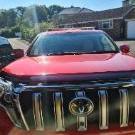
Cruise Control Not Engaging
Hi. My 2008 Rav 4 cruise control has not worked since I’ve owned it. When the on button on the stalk is pressed nothing happens, not green cruise dash light or anything. Previously, I’ve had a problem when the ABS, VSC and parking brake light all turned on but that was fixed by a brake light switch replacement. But the cruise still does not work. I’ve checked all the fuses and all are good. Is this a common issue and does anyone know why it’s happening. thanks -
0
Head Unit with Apple CarPlay
Hello everyone, I'm sure there would have to be someone with the same topic but I'm looking for a good head unit for my wife's 2014 RAV4 with Apple CarPlay that wirelessly connects to the phone and has set up so she can connect steering wheel controls and still use her reverse camera, any suggestions please? Thank you so much everybody! -
4
Toyota Corolla 2012 zre152 4 speed automatransmission issue
No all good herb I know your trying to help, I should have been more clear, I have updated my wording. Thanks alot -
0
2007 - Floor mat
Hi. I have a nice 2007 Grande which is still in good nick, except for the drivers floor mat. Normally it wouldn't be a problem to replace the floor mat but because it has the word CAMRY embroidered into the floor mat, I would like to replace it with the same again. I'm feeling reasonably confident that a Toyota dealership would just laugh at a request for another factory one so my question is, is it even still possible to locate an embroidered floor mat for my 17 year old car? If so, where? Or is there a business that will replicate the original? -
4
Toyota Corolla 2012 zre152 4 speed automatransmission issue
OHH! I missed that. Herb -
4
Toyota Corolla 2012 zre152 4 speed automatransmission issue
Thanks for your reply, it's an automatic 4 speed. -
4
Toyota Corolla 2012 zre152 4 speed automatransmission issue
Hi Gary, I would suspect a clutch problem, like not fully disengaging. Maybe you aren't fully pushing it to the floor, or the system needs topping up or bleeding or both. Herb -
4
Toyota Corolla 2012 zre152 4 speed automatransmission issue
Hi Toyota owners, I'm new to this forum registration. I need some advice or help as I have a shifting issue with my 2012 4 speed automatic transmission. It doesn't do it all the time but the gears don't shift smoothly specially 3 to 4 gear it just bangs in when I'm cruising and it happens more often when hot. Got full transmission serviced with Toyota genuine parts no metal shavings in pan. Changed ATF 3 times. Full major service done, 100000 KLM on car. Full synthetic oil with 98 Ron fuel. Throttle body cleaned twice. Maf sensor cleaned. New spark plugs. No engine codes. Great loss of power sometimes specially on hot days. Please help as no mechanic knows what the issue is. Thanks in advance. -
46
Lowering a Corolla ZRE
Very nice mate, do you have the lovels part number? Are the front sport low and the rear super low? -
3
Auto door locking on new 2024 C-HR?
Yes mine is October 2023. It arrived late February Early March to the docks in Brisbane. I have a friend who has been told that hers will be in the next shipment but is only on the production line now. So future stock should be 2024 ! ?
-


Recommended Posts
Join the conversation
You can post now and register later. If you have an account, sign in now to post with your account.